2025 Annual Report
ArborGen Holdings
A bold new chapter in an evolving story
We’ve had the pleasure of designing ArborGen’s Annual Reports for several years now – each one an opportunity to refine, reframe and re-energise how their story is told. For the 2025 edition, we partnered with the team again to create a refreshed, forward-focused report that builds on previous foundations while pushing into bold new design territory.
The result is a cohesive, landscape-format publication that celebrates ArborGen’s work in forestry and biotechnology – presented with clarity, purpose and a distinct sense of confidence.
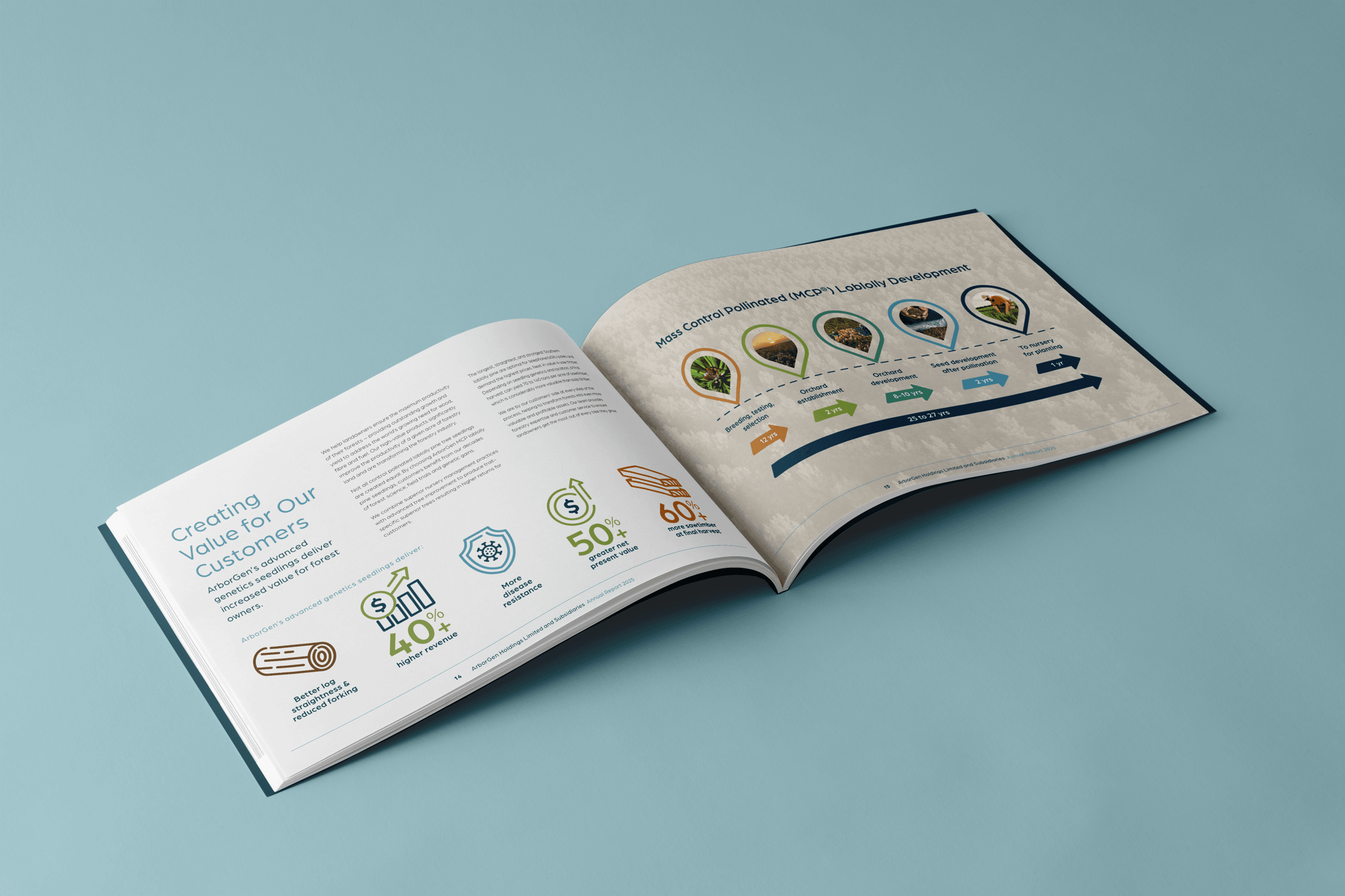
Landscape for greater impact
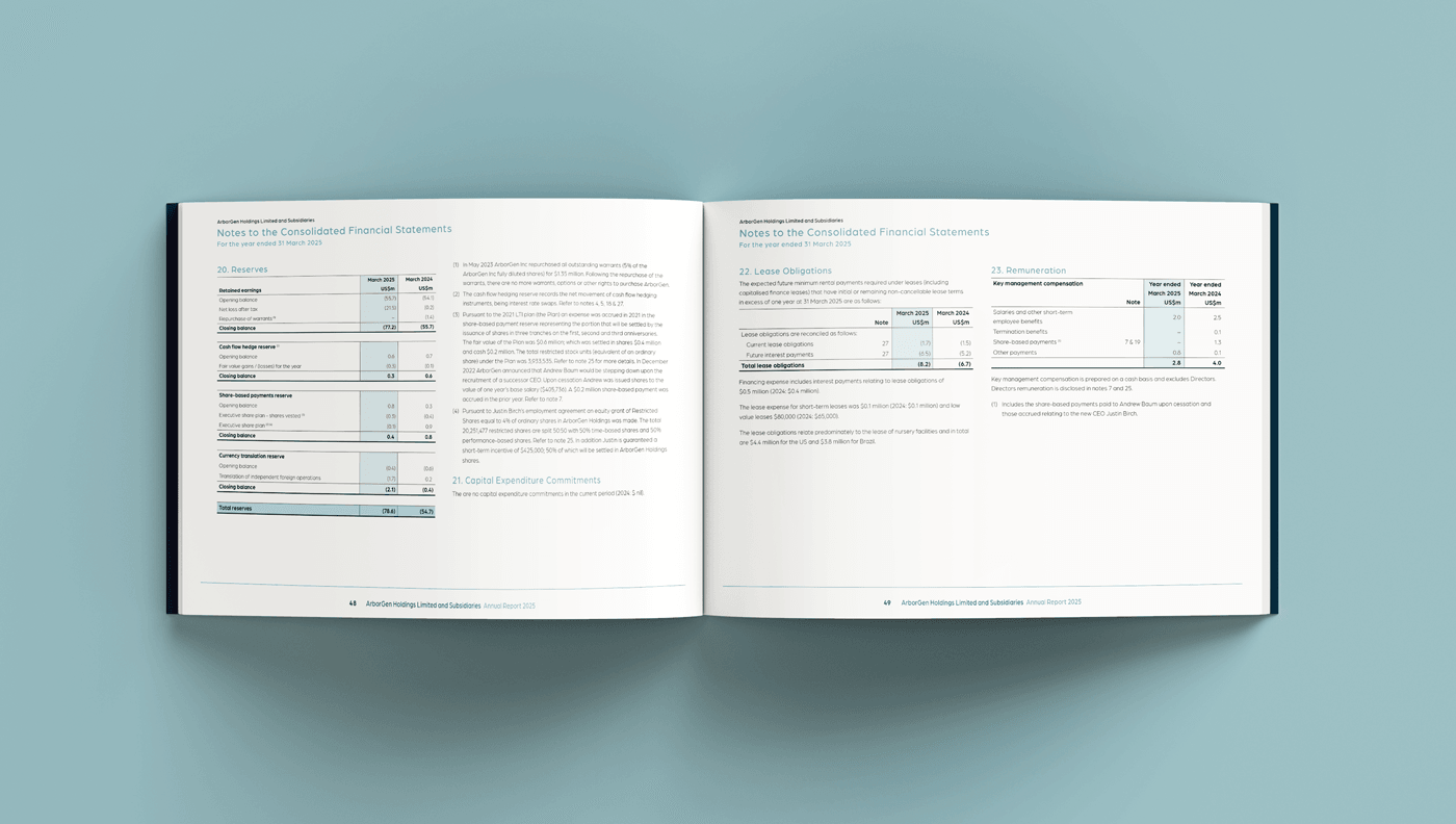
This year, ArborGen made the strategic decision to move away from the traditional portrait format in favour of a landscape layout – and the shift paid off. The new orientation allows for stronger visual rhythm, more immersive content spreads, and improved usability across both print and digital formats. It also gave us the flexibility to frame key elements like tables, charts, photography and narrative content in a way that’s easier to navigate and more engaging to read.
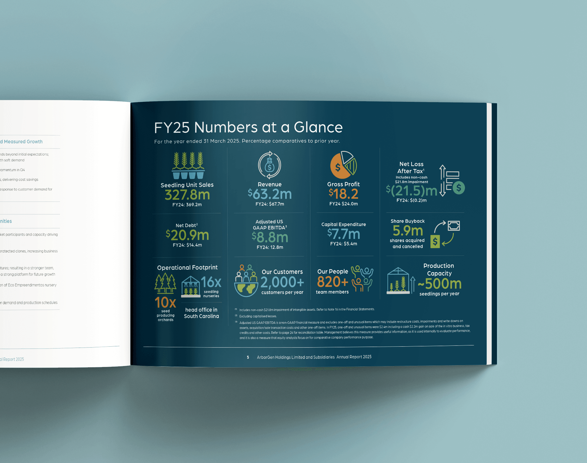
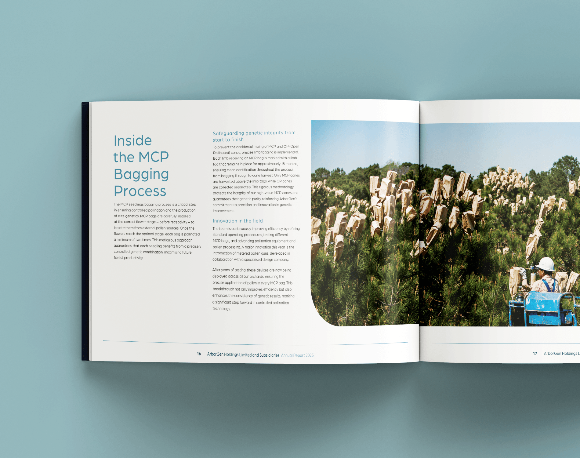
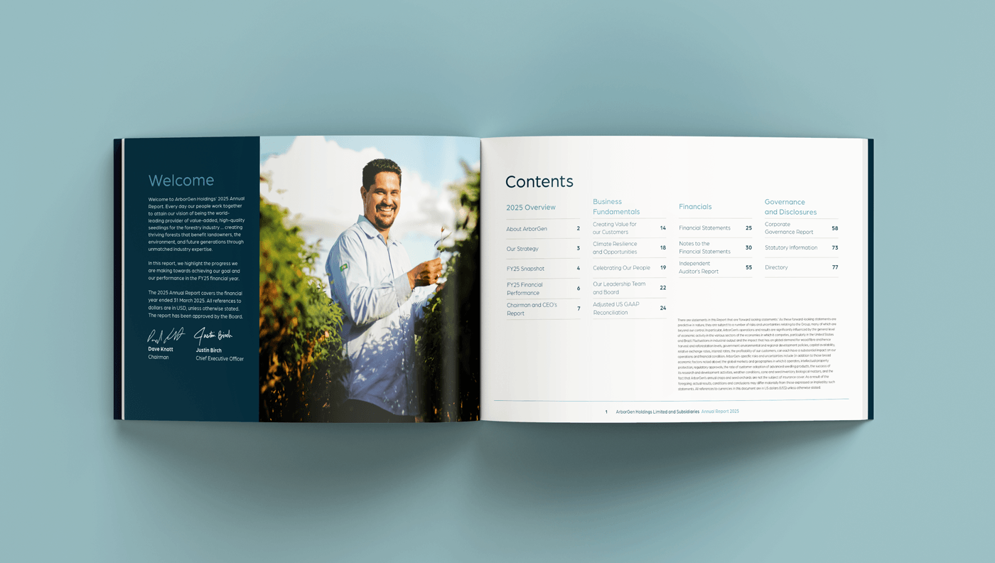
Designed for clarity, crafted with care
We applied meticulous attention to the typesetting of both narrative and financial sections, ensuring consistency and legibility throughout—particularly across data-rich tables and structured financials. With a clear design hierarchy, seamless pacing, and custom visual assets, the report delivers information in a format that feels considered and easy to digest.
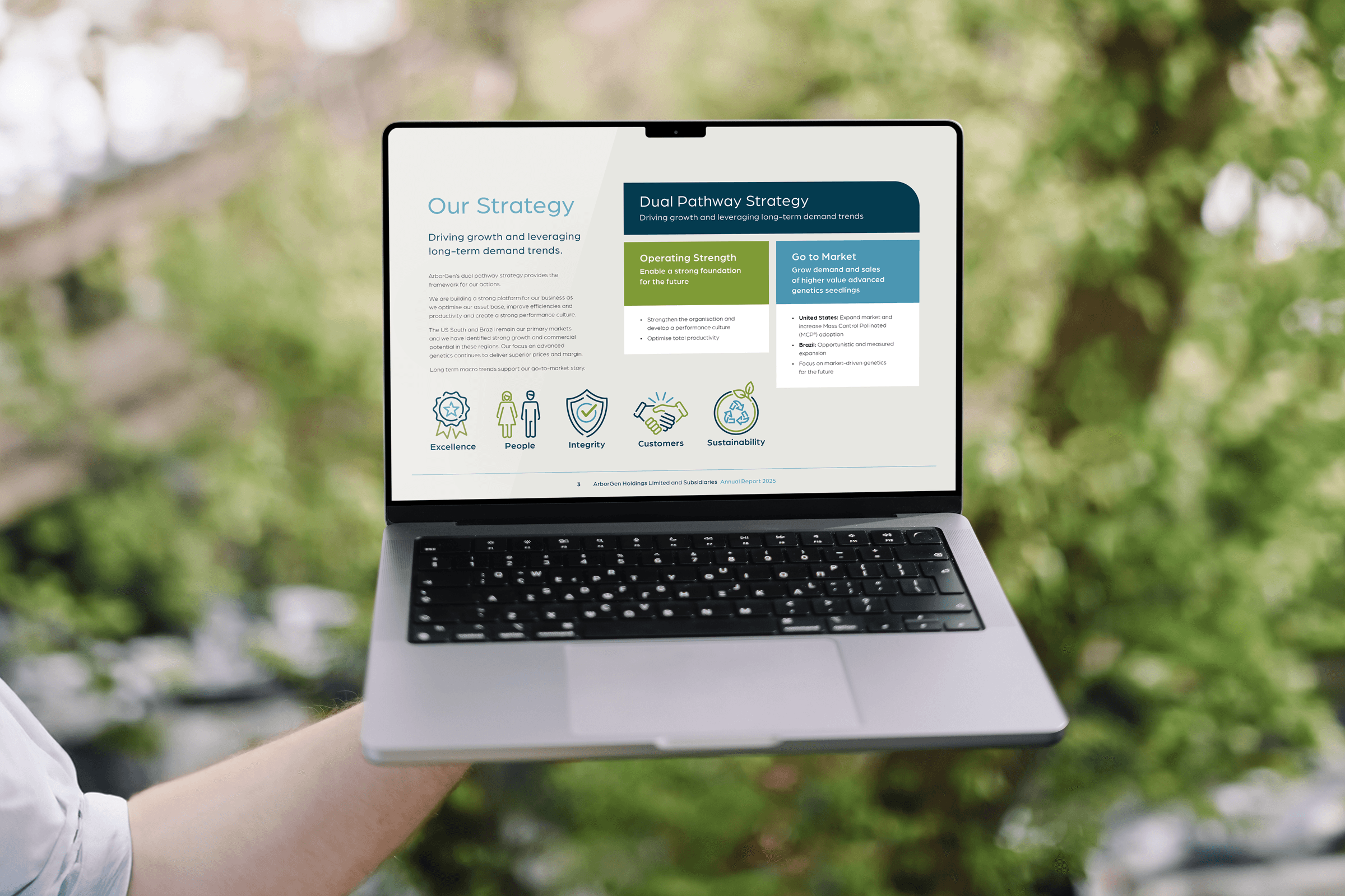
A key part of our approach was designing a suite of custom icons and infographics to highlight performance milestones and key takeaways. These elements give shape to the story while helping readers find what matters most, fast.
Throughout the report, ArborGen’s people and products are heroed through well-composed, high-quality imagery that brings authenticity and human connection to the content—celebrating the real-world impact behind the numbers.

A bold and confident new look
Visually, the 2025 report leans into a bold and contemporary aesthetic. Balanced layouts, confident typography, and a refined palette of blues and neutrals help this edition stand apart from previous years while still feeling unmistakably ArborGen. It’s a polished evolution that signals both continuity and progress.
